Goal: Make the front of a cereal box. When you finish, use it as the front of the full cereal box.
IMPORTANT!
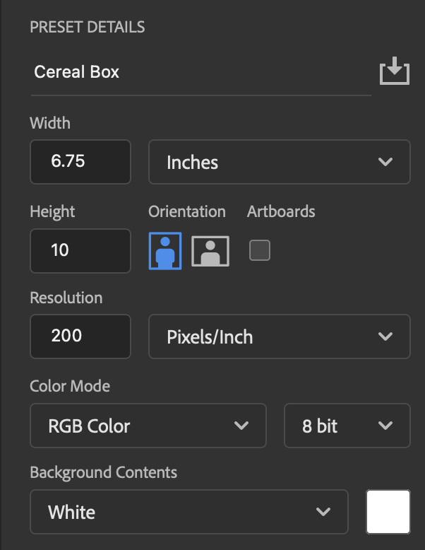
If you plan to use your cover for the Cereal Box II project (where you make the whole box), the best size for this project is 6.75 inches wide, 10 inches high, and 200 pixels per inch.
This is a typical front of a cereal box with the parts labeled:
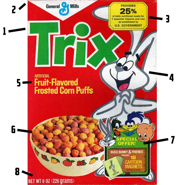
- The name of the cereal. Big letters, bright, contrasting color, and an outline help it stand out.
- The company that makes the cereal
- A badge telling why you should eat the cereal
- a mascot
- a description of the cereal
- a picture of the cereal in a bowl
- A badge that tells about a special offer.
- The weight of the cereal.
Yours should look as much like a real cereal box as possible, but it needs to be about a cereal you make up. Here are two examples:


If you need help making it look like the cereal is in the bowl, you can find a mini-tutorial here.
IMPORTANT!
If you plan to use your cover for the Cereal Box II project (where you make the whole box), the best size for this project is 6.75 inches wide, 10 inches high, and 200 pixels per inch.
Making the Logo
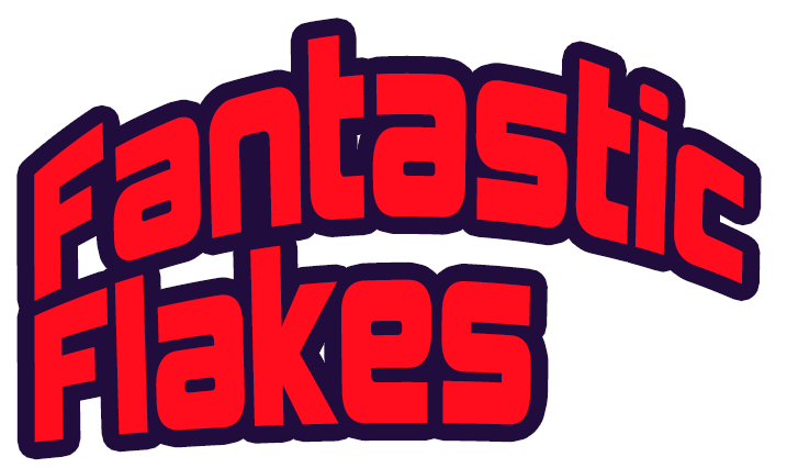
The name of the cereal should be more than just straight text. Photoshop makes it easy to add curves and borders. Here is a sample. Don’t copy it exactly- use it as a starting point.
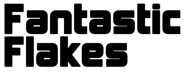
This will be a logo for a cereal called “Fantastic Flakes.” Let’s start with a basic font.
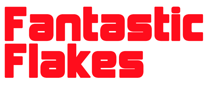
Next, we can change the color:
Now we can add a stroke around the letters. In the layer palette, double click the text layer (in the blank space next to the words). The layer style menu will open. Depending on what you have added to layers in the past, it may show multiple copies of some effects, or effects may be missing. If you would like to have the default set of effects, select the fx in the bottom left corner of the palette, the select “Reset to Default List.”
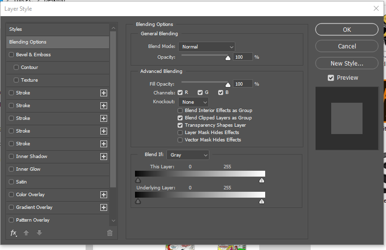
Select “Stroke” clicking on the word, NOT just the checkbox. If you (like here) have more than one “Stroke” choice, any one of them will work.
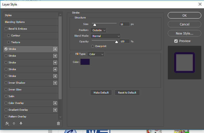
You can choose any color and thickness that you like. Here’s what I chose:
And this is how it looks:
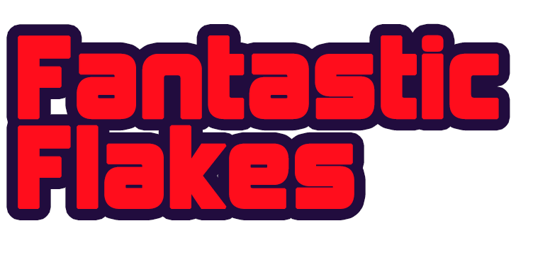
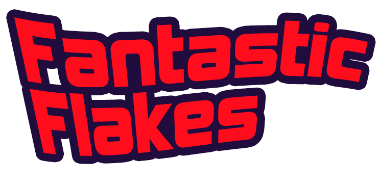
This could work as is, but let’s try bending it a bit.
Close the layer palette. Make sure you’re on the text tool. At the top of the screen, select the “create warped text” icon.

The Warp Text window will open. It will look something like this:
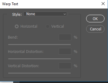
Try different styles. Each style will have a set of sliders to adjust the effect. Keep trying until you get an effect you think works. Here are some examples: